Farrow & Ball’s paint color, Dimity, has garnered widespread acclaim, emerging as a favored choice for homeowners seeking a warm neutral that enhances interior spaces. With its subtle red undertones, Dimity creates a soft, calming environment, making it an ideal option for various rooms in the home.
After utilizing Dimity in four distinct areas, the color has proven its versatility, adapting beautifully to different lighting conditions and design elements. Instead of feeling repetitive, it acts as a cohesive thread throughout the home, offering a sense of warmth that many neutral shades often lack.
Dimity’s Unique Characteristics
Unlike typical neutral paints that can appear bland or overly cool, Dimity stands out with its nuanced warmth. According to Patrick O’Donnell, brand ambassador at Farrow & Ball, the color’s slight red undertones make it particularly suitable for dimly lit spaces, combating the flatness often associated with standard whites.
In application, Dimity pairs well with other colors, such as Farrow & Ball’s Pointing, enhancing woodwork and ceilings without overwhelming the overall aesthetic. This balance allows it to maintain a traditional feel while avoiding any sense of datedness. Designers have noted that Dimity lends itself to both period and contemporary homes, making it a timeless choice for various styles.
Practical Applications in Home Design
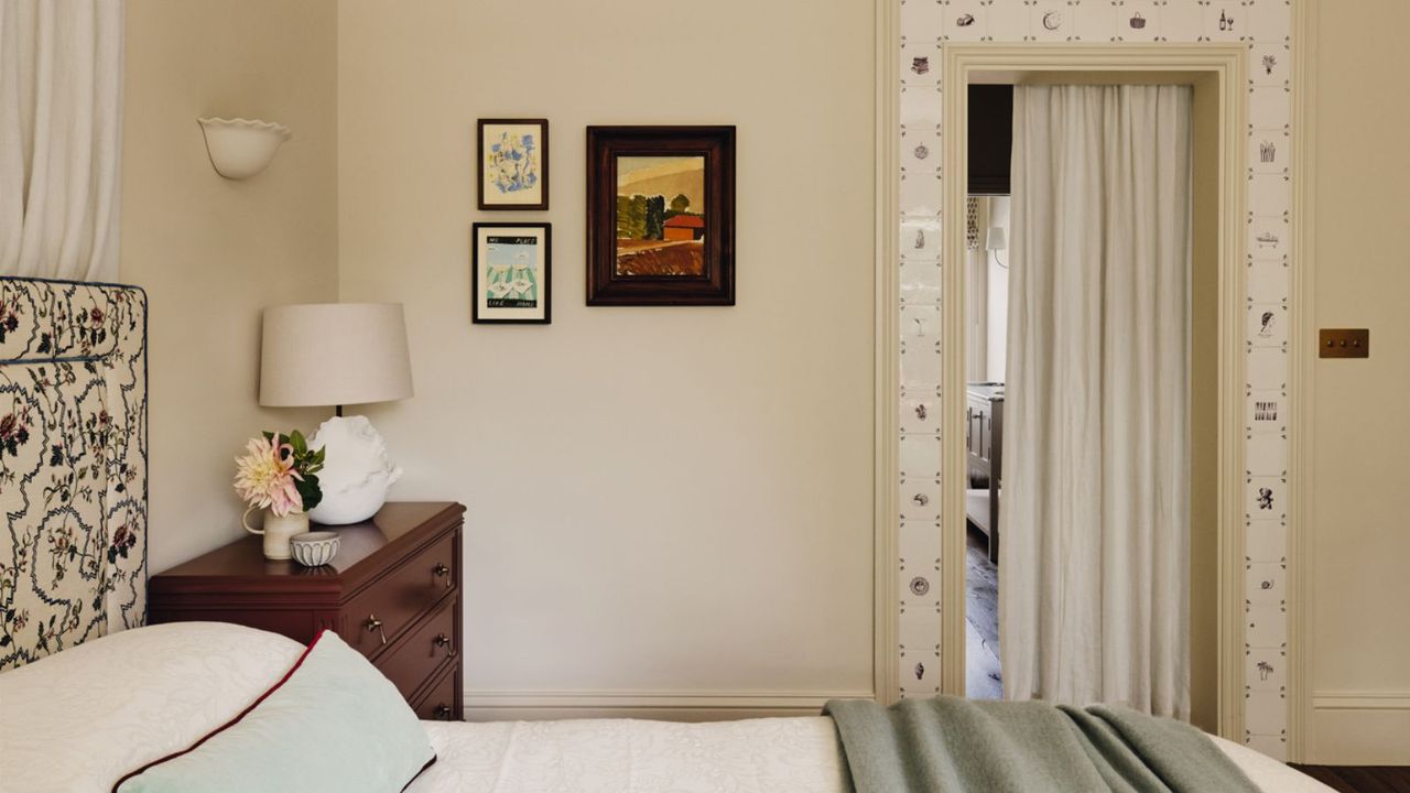
In a recent renovation of a Victorian house, designer Emma Ainscough utilized Dimity in the master bedroom, harmonizing it with burgundy nightstands and powder accents. This strategic choice demonstrates how Dimity can complement bold colors while preserving a serene atmosphere.
The versatility of Dimity extends to various rooms, including kitchens and bathrooms, where it serves as a gentle backdrop for vibrant décor. In one case, interior design studio Eadie & Crole selected Dimity for a colorful Victorian property in London, applying it to beadboard paneling for a soft, inviting ambiance.
In spaces with varying light conditions, such as a west-facing snug, Dimity consistently maintains its color integrity. Even when illuminated by direct sunlight, it avoids becoming washed out or overly sweet, instead adapting to create a dynamic environment throughout the day.
The Enduring Appeal of Dimity
Beyond its aesthetic qualities, Dimity presents practical advantages for interior designers and homeowners alike. As noted by Cindy McKay, an interior designer, the shade offers a timeless quality that enhances warmth without veering into overly yellow or beige territory. Its forgiving nature allows it to work seamlessly with various patterns and bolder hues, making it a reliable choice for multiple applications.
Ultimately, Dimity’s understated elegance is what makes it so appealing. It serves as a perfect backdrop, allowing other design elements to shine without demanding attention itself. Having tested this shade across varied settings, it is clear that Dimity is not only a dependable choice but one that can be revisited time and again for its versatility and charm.
For those considering a fresh look for their home, Dimity stands out as a top contender for creating inviting, tranquil spaces that are both modern and timeless.